News
 Red-Andy 1.00 becomes responsive and blogish
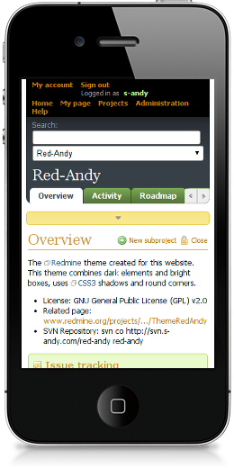
There were two motives for this release to happen – the wish to make my website readable on mobile devices and the wish to launch a blog with the Red-Andy theme. Both wishes used to seem unrealizable, but finally both of them come implemented in Red-Andy 1.00!

Red-Andy becomes responsive
I used to check some information on my website using my Samsung bada-powered smartphone. That is, I was trying to – as, in fact, I found it intolerable! That’s why I decided to try making Red-Andy responsive. It’s was not easy and involved some hacks, but finally I did it! Now I do can check my site from my smartphone.
To be honest, it’s not perfect. To be even more honest, it has many issues! But, at least, with Red-Andy 1.00 the vast majority of Redmine pages can now be comfortably read on your mobile devices.
Check this page for more screenshots of mobile screens.
Red-Andy becomes blogish
Long time I planned to launch a blog. And, finally, I did it recently! To have the look and feel of my blog consistent with the look and feel of my Redmine I developed the RedWord theme for WordPress, that acts as the compatibility layer between WordPress and Redmine themes. So for my WordPress I use the same Red-Andy theme!
But, as you might know, the design of a blog differs a bit from design of rest application types (including project management tools). Thus, usually it’s more reading-oriented. I noticed this quite well, when I started to use the (old) Red-Andy theme for the blog, so finally I decided to make Red-Andy more blogish...
Starting from Red-Andy 1.00 news and (partially) Wiki pages have more blog-like look and feel – i.e., they use the different font (Georgia), their headings are neater, and so on. At least, I personally find the new style more suitable for reading. This news, by the way, is a great example of the new design.
The same style is used for blog articles under RedWord/WordPress.
Red-Andy just becomes better
The last release of the Red-Andy theme (0.02) was done more than 2 years ago, so certainly a few updates were made to the theme since then. These updates include bug fixes (#1924, #2048, #2058, #2195 etc) and improvements:
 Red-Andy theme 0.02
Updated my Red-Andy theme! List of “visual” changes you can find here. They include:
- In my opinion:
Quotes now look much better
- Code now is
highlighted - Wiki lists now have more space (between rows)
- Wiki TOC now has indents
- Styled associated revisions (changesets)
- etc.
Should mention the following people who helped me in finding bugs and testing: Tim Lin and Ivan Cenov.
Also available in: Atom

